Modern colour theory is as much science as it is art, and knowledge of the use of colour theory in web design can...
Imagine landing on a website where the colours feel chaotic and overwhelming versus one where they harmonise seamlessly, guiding your eyes effortlessly to key elements.
A deep understanding and application of colour theory in web design isn’t optional. It’s an essential ingredient in your website’s success.
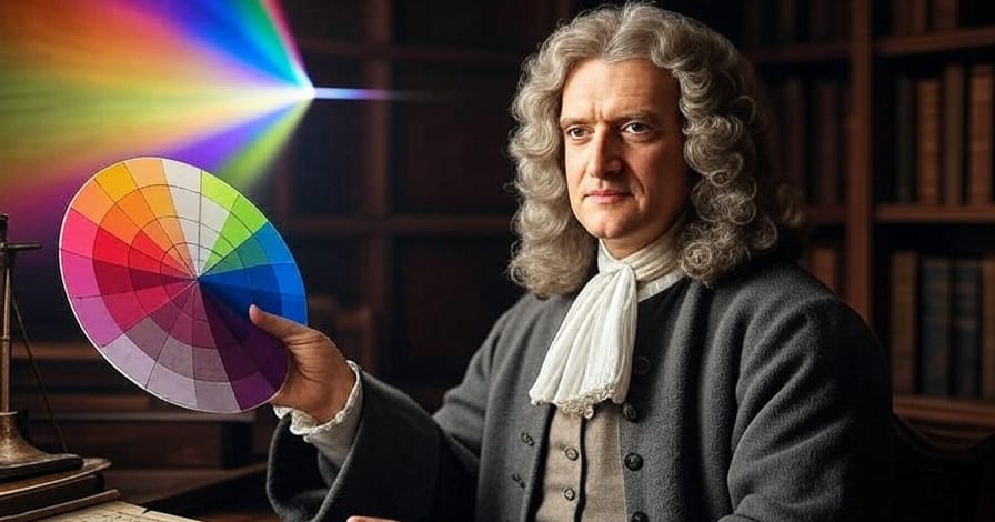
Colour theory traces its roots back to Sir Isaac Newton, who developed the colour wheel in the 17th century. Newton’s colour wheel laid the groundwork for how we perceive and combine colours today.
Colour theory in web design encompasses everything from selecting palettes that align with brand goals to ensuring accessibility for all users. According to research, 62% to 90% of consumers use colour to help form opinions about a product or brand.
This underscores the psychological impact that colours have on us, and the importance of using colour wisely on your business website.
This extensive guide to colour theory in web design will delve into the fundamentals, schemes, psychology, accessibility considerations, tools, best practices, and real-world examples to equip you with the knowledge you need to create compelling colour palettes for websites.
Whether you’re a novice designer building your first site or a seasoned pro refining your craft, mastering colour theory will elevate your work. In this article, we’ll explore how colours can convey...
We’ll look at why blue confers reliability while red conveys a sense of urgency and inspires people into action. You’ll discover that colours are more than aesthetic, they’re psychological triggers. By the end of this article, you’ll...
Let’s start at the beginning and dig into this fascinating topic!
The colour wheel is a cornerstone tool for graphic designers. Rooted in science, it creates a visual guide to harmonious and impactful visuals.
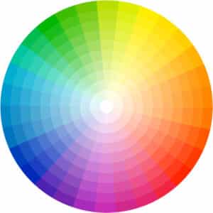 | The colour wheel is a circular diagram that organises colours based on their relationships. Traditionally, Newton’s colour wheel features the primary colours of red, blue, and yellow. A primary colour is one that can’t be created by mixing together other colours. |
Colour theory in web design states that secondary colours are created by mixing primary colours...
Tertiary colours emerge from blending primary and secondary hues, such as yellow-green or blue-purple.
Some modern interpretations of colour theory in web design suggest we replace red, blue, and yellow as our primary colours with magenta, cyan, and yellow because they’re more important in digital contexts.
There are several key terms, widely used when discussing colour theory in web design, that it’s useful to know...
Given the requirements of colour theory in web design, these elements translate easily to digital formats like RGB (Red, Green, Blue) for screens, or HEX codes for colour specification in HTML. The hex codes in HTML relate directly to RGB as follows...
Understanding Newton’s colour wheel helps to identify important relationships between colours when creating a palette, allowing us to make use of the principles of colour theory in web design. In particular, it makes it easier to see that colours...
According to colour theory in web design, human perception plays a role in how a colour appears. A colour can appear differently based on the colours it’s surrounded by, as in the following three panels.
For example, the following blocks each contain a small square of the same colour, yet we perceive the inner squares getting lighter as the surrounding colour darkens.
Other factors that impact how a colour is perceived include lighting, contrast, patterns contained within a coloured area, gradients of colour, and cultural associations. For example, white symbolises purity in Western cultures but mourning in some Asian ones.
Web Designers must consider the emotional impact conveyed by a particular colour palette to avoid unintended consequences.
Brighter, more saturated colours draw attention to calls-to-action (CTAs), while a muted palette is useful for creating backgrounds. A high-value blue background with low-saturation accents conveys readability and doesn’t overwhelm the senses.
Mastering these basics of colour theory in web design prevents common pitfalls such as clashing colours that confuse navigation or fail to reflect a brand’s ethos. As web design evolves with trends like dark modes, it has become necessary to adapt these principles.
Now that you’re grounded in the fundamentals of colour theory, the next step is to select colour schemes and combinations that create balance and visual interest.
A colour scheme is derived from Newton’s colour wheel and dictates how different colours interact on a website. Let’s examine different schemes that arise from colour theory in web design.
In colour theory, a monochromatic scheme is based on a single hue (base colour) and its variations in value (lightness or darkness) and saturation (intensity). This approach creates harmony by sticking to one colour family, avoiding the contrast of multiple hues while relying on subtle differences to add interest.
It's one of the simplest and most cohesive schemes, often evoking a sense of unity, calmness, or sophistication.
How a Monochromatic Scheme is Created
We start with a Base Hue from the colour wheel, such as blue, red, or green. We then vary the value...
As every colour in a monochromatic scheme derives from the same hue, they are guaranteed to blend seamlessly without clashing.
This scheme aligns with the principles of colour theory in web design, like those in the traditional colour wheel developed by Sir Isaac Newton and refined by artists like Johannes Itten.
Unlike analogous (neighbouring hues) or complementary (opposite hues) schemes, a monochromatic palette focuses purely on one hue's spectrum.
Examples of Monochromatic Schemes...
In practice, designers seeking to apply colour theory in web design often incorporate neutrals (like white or black backgrounds) to enhance the scheme without disrupting its monochromatic nature.
Advantages and Uses
Monochromatic palettes create harmony and simplicity. They are visually balanced, don't overwhelm composition, and are ideal when used with minimalist designs, logos, or interiors where focus is key.
Depending on the hue, this scheme can convey specific moods. For example, green conveys tranquillity, blues calmness, and reds a sense of action, urgency, or intensity.
Based on colour theory in web design, a monochromatic palette may create challenges with accessibility if there's a lack of contrast. This can make text difficult to read, especially for the visually impaired.
Potential Drawbacks
While elegant, monochromatic colour palettes sometimes feel flat or boring if the variations aren't sufficiently diverse.
These schemes lack the vibrancy of multi-hue schemes, and designers often pair them with textures, patterns, or accents to add a sense of depth.
Overall, monochromatic schemes are a foundation of colour theory in web design, emphasising subtlety over boldness and serving as a great entry point for understanding colour relationships.
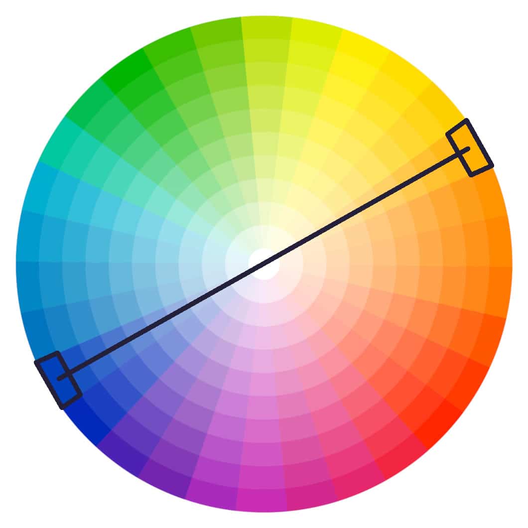
A complementary colour scheme refers to a pairing of colours that are positioned directly opposite each other on the colour wheel. This arrangement creates a high-contrast combination that can make designs feel vibrant and dynamic, as the opposing hues intensify each other when placed side by side.
Like most colour theory in web design, the concept stems from the traditional colour wheel. This organises colours based on their relationships, with primary colours (red, blue, yellow) forming the base and their opposites serving as complements.
Complementary colours also have a unique property: when mixed together in equal parts, they neutralise each other to produce a grayscale tone, such as white, black, or grey, effectively cancelling out their individual chroma (colour intensity). This is why they are often described as "opposites" that balance one another.
How Complementary Schemes Work
Newton’s colour wheel is key to understanding the complementary colour scheme. To create a palette based on this scheme, select a colour and then choose the one directly across from it on the wheel.
For instance, if you start with blue, its complement is orange. This high-contrast effect draws the eye and can evoke energy or tension, making it ideal for highlighting elements in art or design.
A common variation is the split-complementary scheme, which uses one base colour and the two colours adjacent to its direct complement. This provides a similar contrast but with more nuance and less intensity, offering greater flexibility in palettes.
Examples of Complementary Pairs
Here are some classic complementary colour pairs, along with their typical associations derived from colour theory in web design...
Complementary colour pairs can be adjusted for tints (lighter versions) or shades (darker versions) to soften the contrast while maintaining the scheme.
Uses and Applications
Complementary schemes are widely applied in a variety of fields, including the use of colour theory in web design...
Overall, complementary colour schemes are powerful for creating impact, but they work best when one colour dominates and the other is used sparingly to avoid visual fatigue.
If you're experimenting with colour theory in web design, use tools such as colour wheel generators to help visualise these pairings in real time.
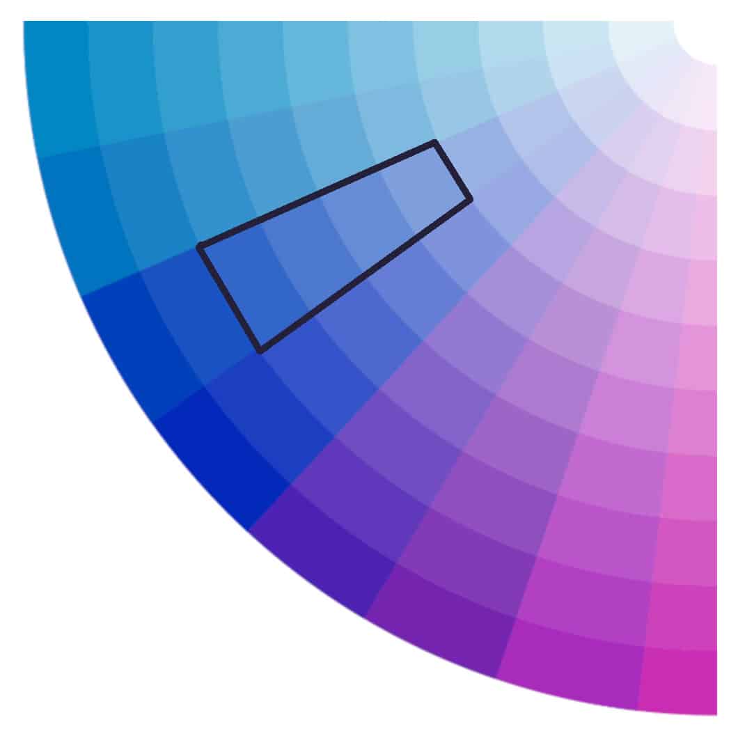
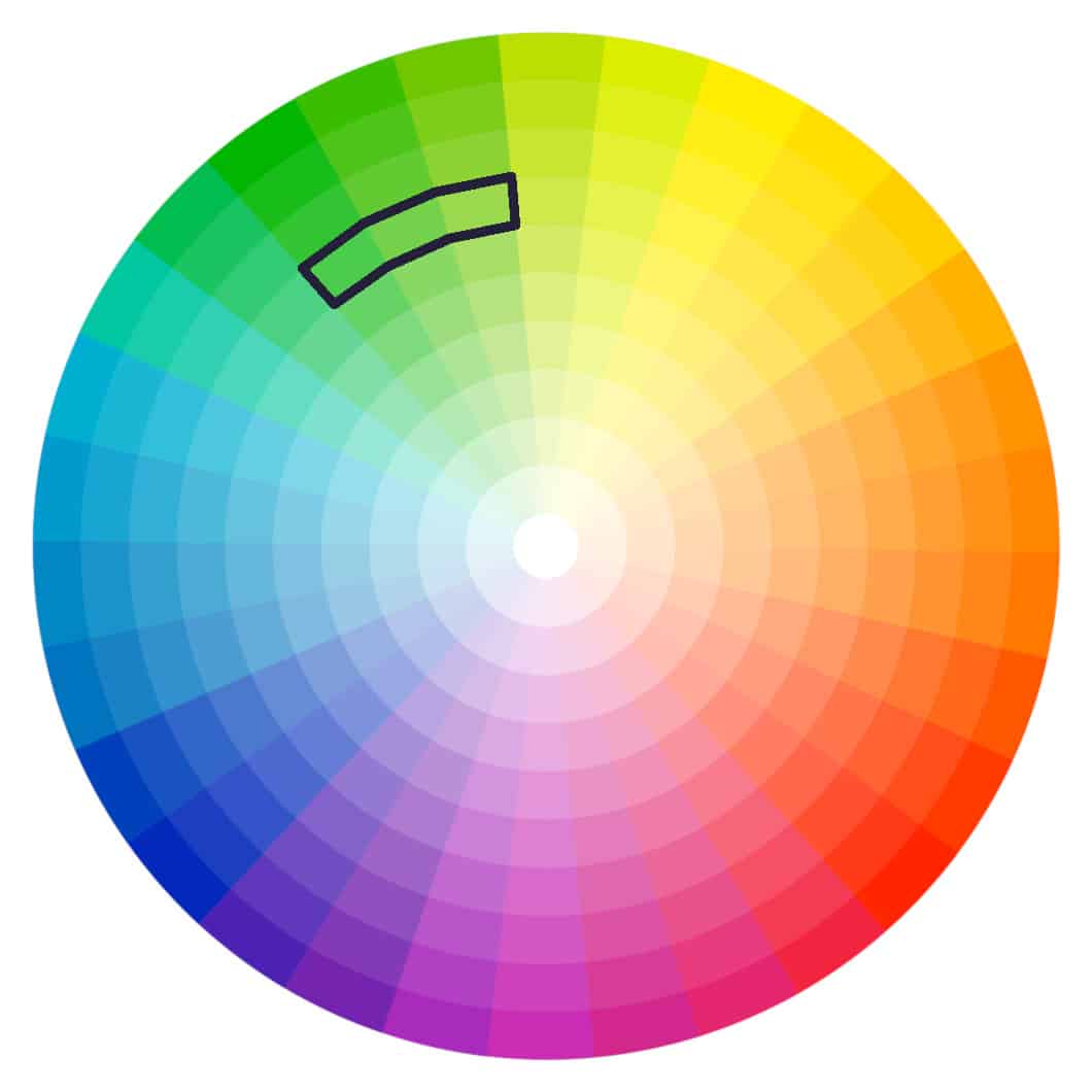
An analogous colour scheme features three adjacent colours, like blue, blue-green, and green, for a serene and cohesive look. Accordingly, colour theory in web design posits an analogous palettes’ colours are subtle, harmonious, and suit content-heavy websites.
Analogous palette typically involves a dominant colour, which is often a primary or secondary colour, and two supporting hues. These schemes are sometimes extended to include a fourth and even a fifth shade for more nuanced variations.
You can use colour theory in web design to create an analogous scheme by starting with a base colour on the colour wheel (e.g., blue), and then selecting the colours immediately next to it (e.g., blue-green and blue-violet).
Choose one of the colours to be the dominant hue for emphasis, with the others acting as accents to maintain balance and avoid overwhelming the design.
This approach ensures the colours blend seamlessly, as they are “related" and often share a common component, like warmth (e.g., reds and oranges) or coolness (e.g., blues and greens).
Examples of analogous colour schemes...
Advantages and Uses
Analogous schemes are prized in colour theory for web design because they offer natural harmony, making them ideal for creating comfortable, unified visuals without high contrast.
They promote a pleasing, cohesive look in fields like interior design, graphic design, painting, and photography, where subtle transitions enhance mood, such as tranquillity in a bedroom or warmth in branding.
However, they can sometimes lack excitement, so designers might introduce a complementary accent for pop.
You can simplify colour theory in web design by understanding how basic schemes use the colour wheel to create harmony without giving you too many choices.
Start by selecting a primary colour that aligns with your brand or mood, such as blue for trust or red for energy, and build a palette from there using simple relationships like complementary or analogous schemes.
Limit your palette to 3-5 colours, selecting one to be the dominant hue. Use a secondary for accents, and neutrals like greys or whites for backgrounds.
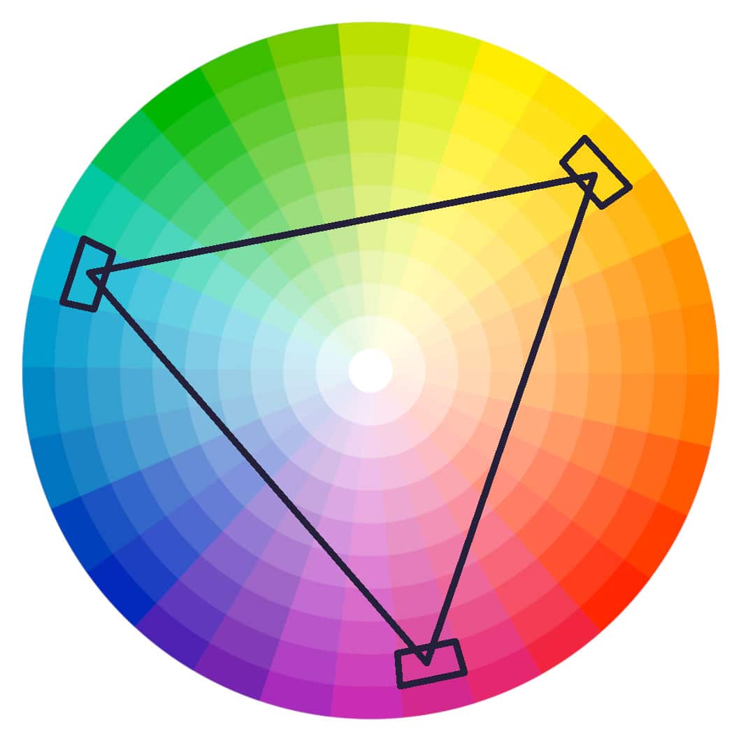
A triadic colour scheme in colour theory consists of three colours that are evenly spaced around the colour wheel, typically 120 degrees apart, forming an equilateral triangle.
This use of colour theory in web design creates a balanced yet vibrant palette, as the colours provide strong visual contrast while maintaining harmony due to their equal distribution.
Here’s how to Create a Triadic Colour Scheme...
This method works well with both primary (e.g., red, yellow, blue) and secondary colours (e.g., orange, green, violet), allowing for flexibility in tone by adjusting saturation or brightness.
Examples of Triadic Colour Schemes
Advantages and Uses
Triadic schemes offer high contrast and visual interest without overwhelming the viewer, making them ideal for designs that need to be dynamic and attention-grabbing.
They promote balance and versatility, allowing for bold themes in fields like graphic design, web development, marketing, clothing, and interior decor.
However, they can appear too intense if not tempered with neutrals, so they're best for projects aiming for energy and excitement rather than subtlety.
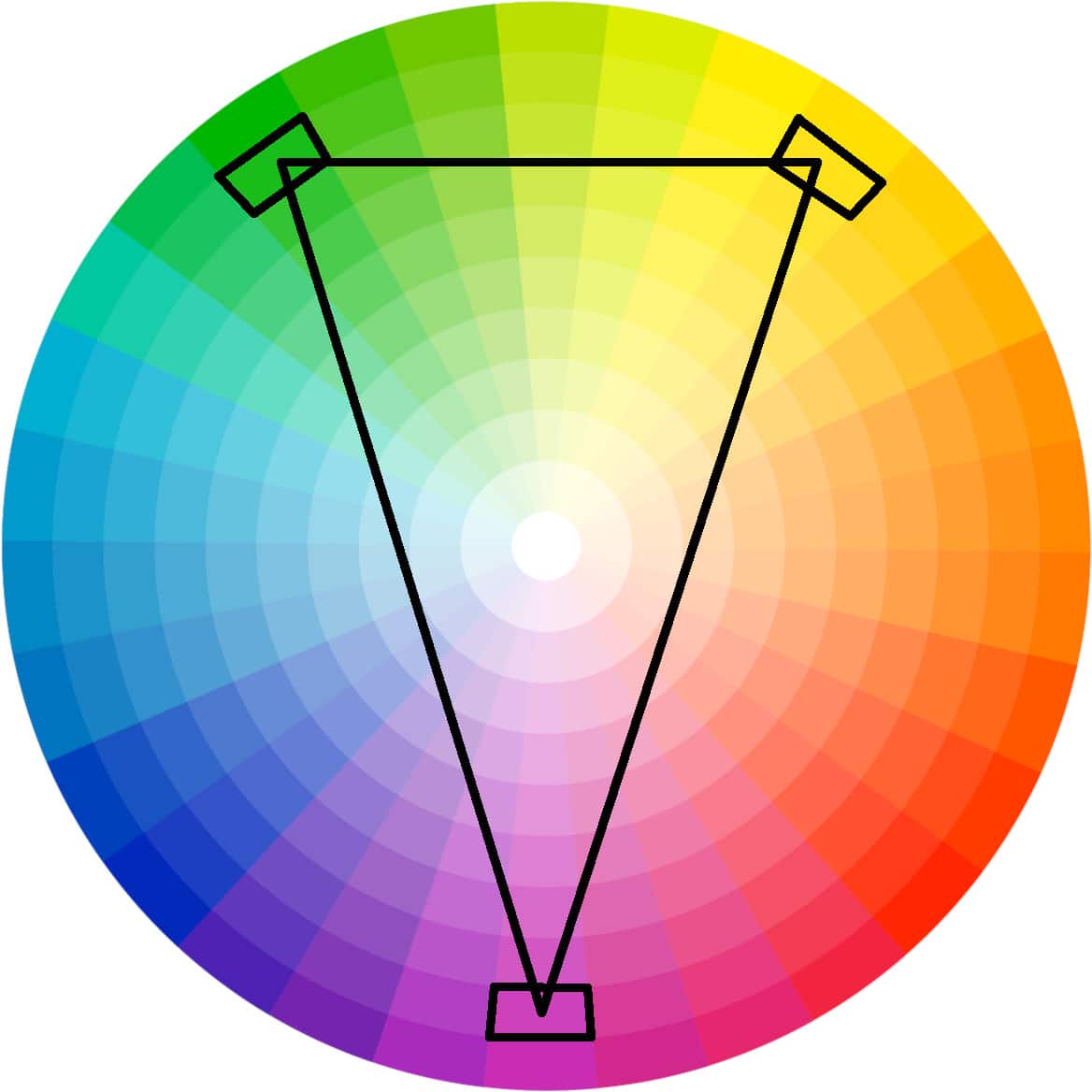
As with all schemes derived from colour theory in web design, a split-complementary palette has its pros and cons. This colour scheme is a variation of the complementary palette, using one base colour and the two colours adjacent to its direct opposite (complement) on the colour wheel.
A split-complementary scheme creates a palette with strong contrast but reduced tension compared to pure complements, resulting in more nuanced harmony.
How to create a split-complementary colour scheme...
This approach allows for greater variety and is easier to work with than straight complementary pairs, especially when incorporating tints or shades.
Examples of Split-Complementary Colour Schemes
Advantages and Uses
Split-complementary schemes provide the visual punch of complements with added harmony and flexibility, making them less jarring and more versatile for creating balanced compositions.
They excel in design fields like fashion, interior decor, graphic arts, and web development, where they add interest without overwhelming, such as in room palettes or logos seeking contrast with cohesion. Colour theory in web design allows the creation of innovative and exciting split-complementary schemes.
This scheme is particularly useful for beginners, as it reduces the risk of clashing while still offering dynamic energy.
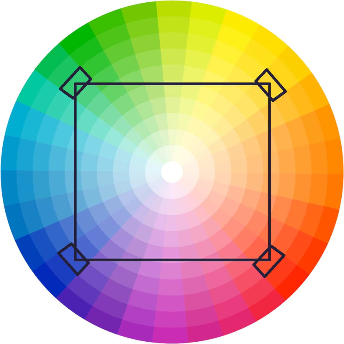
A tetradic palette is a harmonious combination of four hues from the colour wheel. Some people call this a tetrad or double complementary scheme.
What we know about colour theory in web design suggests that a tetradic colour palette will be among the most difficult to implement, and that is indeed the case.
The tetradic palette consists of two pairs of complementary colours that sit opposite from each other on the wheel, such as red and green, or blue and orange. This creates a vibrant palette that offers more variety than monochromatic or triadic schemes.
Colour theory in web design enables us to visualise this scheme by drawing a square on the colour wheel, and connecting the four points to select our colours.
This results in a dynamic interplay of hues that can evoke energy and complexity, making it popular in design fields like graphic design, interior decoration, and web development.
How to Create a Tetradic Colour Scheme
To build a tetradic scheme, start with a base colour on Newton’s colour wheel and identify its complement directly opposite. Then choose another complementary pair adjacent to the first, forming either a square with 90-degree angles on all four corners.
The resulting four colours include two primary complements and their neighbouring pair.
For example, red (#FF0000) and green (#00FF00) as one pair, with blue (#0000FF) and orange (#FFA500) as the second pair. This forms a rectangle on the wheel, providing high contrast and visual interest.
Tools that make use of colour theory in web design, like a colour wheel calculator will generate these schemes for you automatically.
Tips for Using a Tetradic Scheme Effectively
Tetradic schemes are versatile but can appear chaotic if mishandled due to their richness. Here’s how to get the most from your square tectradic palette using the principles of colour theory in web design...
A tetradic scheme adds depth and excitement to your web design while maintaining theoretical harmony, making them a powerful tool for colour theory in web design when applied thoughtfully.
There are two Types of Tetradic Scheme
A square tetradic, where all four colours are evenly spaced at 90-degree intervals on the colour wheel creates a bold, symmetrical harmony but can feel intense if not balanced.
The alternative is a rectangular tetradic, which is covered below. Colour theory in web design tells us a rectangular tetradic offers us more flexibility and will be easier to balance, as the spacing isn't perfectly equal.
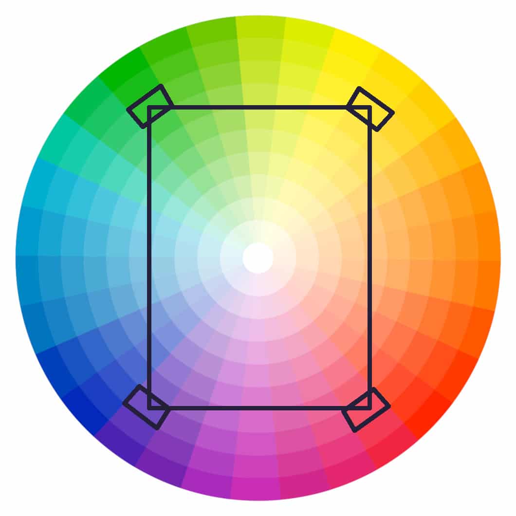
A variation of the tetradic colour scheme is the rectangular tetradic palette, which is also known as a rectangular tetrad, or a double complementary rectangular. Colour theory in web design tells us this is a type of tetradic palette that uses four colours arranged in a rectangle rather than a square.
A rectangular tetrad consists of two pairs of complementary colours, which are hues that sit opposite each other on the colour wheel, and will create a balanced yet versatile harmony.
This scheme offers more flexibility than its square counterpart because the rectangle allows for uneven spacing between the colours, resulting in one pair being closer together (analogous) and the other farther apart (stronger complements).
The rectangular setup provides high contrast and visual interest while maintaining equilibrium, making it suitable for designs that need energy without overwhelming chaos.
In the world of colour theory in web design, a rectangular scheme is usually preferred over a square tetrad because its offers adaptability and allows us to achieve subtle variations in tone and temperature.
How to Create a Rectangular Tetradic Scheme
Here’s how to form a rectangular tetradic colour scheme...
This method results in a palette that isn’t equally spaced, unlike a square tetradic, allowing a primary hue to dominate while the others support it.
An online colour wheel generator automate the process of generating a tetradic colour scheme, and some even help you to visualise the resulting triangle by overlaying it. You’ll find many such tools in the sidebar on the top right of this article, or below it if you’re reading this on a mobile device.
Examples of Rectangular Tetradic Schemes
Here are practical examples from colour theory in web design, with approximate hex codes for illustration...
Colour theory in web design tells us that the order and dominance matter in a rectangular tetradic scheme. For instance, emphasising blue-violet in the last example shifts the mood toward cooler, more mysterious vibes.
Differences from Square Tetradic Schemes
While both are tetradic (four-colour) schemes, the rectangular version differs from the square in spacing...
The rectangular is easier to work with for beginners due to its inherent flexibility in tone variation.
Tips for Using Rectangular Tetradic Schemes Effectively
Applications in Design and Beyond
Rectangular tetradic schemes are widely used in fields like interior design, photography, fashion, and digital media for their ability to convey complexity and depth.
In photography, they guide composition by balancing complementary elements in a scene. They're also effective in branding for creating dynamic logos or websites that stand out without visual fatigue.
Overall, this scheme's strength lies in its harmonious versatility, allowing creators to build engaging visuals grounded in the principles of colour theory in web design.
Over the years, colour theory in web design has produced the 60-30-10 rule. This states that...
The result is a visual “rhythm” that prevents fatigue.
In practice, a website’s colour schemes will align with the site’s goals. An e-commerce site might use a complementary palette to generate urgency, while a portfolio site will favour monochromatic colours for elegance.
The web designer can use A/B testing to ensure a scheme resonates, as a poor choice of colours will increase bounce rates by making the website difficult to navigate or read.
Trends like gradients (blending analogous colours) or duotones add modernity, but best practice for colour theory in web design states that we should prioritise harmony.
Tools like Adobe Colour can generate schemes from images, ensuring they fit your brand's story. These tools help you to apply colour theory in web design correctly. See the sidebar on the top right (or below if you’re using a mobile device) for a wealth of free online tools you can use.
You’ll find more information about the 60-30-10 rule and how colour theory in web design suggests we should use it in the following video...
When applying colour theory in web design, colours aren’t merely visual. They are viewed as emotional catalysts.
The field of colour psychology studies how hues influence perceptions, behaviours, and decisions, making it an indispensable contributor to our application of colour theory in web design.
Colour theory in web design posits that each of the main colours evokes specific responses in people...
Combining UX with colour theory in web design allows us to view colours as guides to action and as navigational components. For example, The One Stop Web Shop uses colours to indicate different sections of the site.
Using colour in this way requires that we use our palette consistently, or users won’t be able to pick up on our subtle clues about the purpose of a section of the site.
Colours can also be used to generate desired actions. For example...
Cultural sensitivity is key. Be sure to test your use of colour with a diverse audience to avoid cultural faux pas.
Aligning psychology with colour theory in web design boosts visitor engagement. Consistent palettes improve memory and boost conversion rates, but overuse can backfire.
You’ll find a wealth of useful information about the psychology of colour on this website.
As you can imagine, colour plays a big role in branding. That’s why the world’s biggest brands spend millions to ensure they’re closely associated with a specific colour, such as Coca-Cola’s red.
The focus of this article is the use of colour theory in web design, so we’re not going to look in-depth at branding. If you want to know more about how colours intersect with your brand, watch the following video...
When applying the principles of colour theory in web design, you should take care to ensure your palette is inclusive. Accessibility ensures websites are usable by everyone, including those with visual impairments.
When it comes to visual impairment, contrast is the key. The WCAG recommends a 4.5:1 ratio for normal text and 3:1 for large text.
Low contrast hinders readability, producing the double-negative of decreasing conversions and increasing bounce rates, which may have a negative downstream impact on your site’s ranking in search engines.
Colour blindness affects one in twelve men and one in 200 women. Avoid relying solely on colour for information. Make use of patterns or icons to enhance the UX for all users.
Tools like Coblis simulate views for deuteranomaly (green-weak) or protanopia (red-weak).
Dark and light themes cater to different preferences and help to reduce eye strain. It’s also useful to know that blue offers a strong contrast for readability.
When you apply colour theory in web design to help you select the colours in your website’s palette, you ensure your colour palette is accessible to everyone.
Best practices
Use WebAIM’s Contrast Checker and test your site with screen readers like NVDA. High-contrast accents guide navigation without alienating users.
Accessible designs needn’t be bland, either. For an example of an impeccably designed site that uses bold contrast, see the Aviaja Dance website.
You can empower your designs with free online tools and resources that simplify colour selection, help you select accessible colours, and remove much of the mystery from the process.
See the sidebar on the top-right of this page, or below this article if you’re viewing on a mobile device.
For a deeper understanding of colour psychology, visit the Interaction Design Foundation and explore its articles and courses.
Download The One Stop Web Shops Colour Theory in Web Design Resource.
Align your website or brand goals with the psychology of colour. For example, favour...
Use restraint when selecting and applying your colour scheme...
Test the use of your palette in page designs using heatmaps, and make use of A/B testing to see how different schemes, tones, and mixes impact engagement.
Colour theory in web design also tells us to consider the colour temperature that is most appropriate for your brand, product, or service...
Make use of simulators and see whether you need to adapt your colour palette to suit different devices and screen sizes.
Incorporate feedback loops to help you refine your colour choices over time, correcting mistakes and becoming ever more inclusive of those without perfect sight. This approach ensures your use of colour will enhance the user’s experience rather than detract from it.
Check out the following real-world application of colour theory in web design that illustrates how colour choice adds or detracts from the user’s experience of a brand, its website, and the company behind it.
The use of colour theory in web design is the silent architect that shapes our emotions, guides visitor interaction, and ensures inclusivity for all visitors. From the colour wheel's harmony to psychology's subtle influences, applying the principles of colour theory in web design will help you to create websites that...
Use the online tools and resources on this page to experiment, test, and refine your colour palette to boost your business website’s ability to engage and convert.
Don’t be shy! Take bold action and experiment, test, and refine. Dive right into the deep end and use the principles of colour theory in web design to add colour to your business website.

In addition to the colour tools dotted throughout this page, here are 18 more options you can explore when applying colour theory in web design...
As you can see, there’s a wealth of free tools and resources available to help you apply colour theory in web design to your project.
Of course, if you find yourself overwhelmed by too many options, get in touch and let’s chat about your project.
Download The One Stop Web Shops Colour Theory in Web Design Resource.

Copyright © 2026 TheOneStopWeb.Shop. All rights reserved.

